If you’re like most tabletop roleplaying gamers, you have a favourite dice set.
What is it about that set that makes it your favourite? Is it because you’ve had it for a long time, or because you’ve made particularly fond memories with it? Or, is it simply because the dice are your favourite colour?
All of these are great reasons, but a recent study says that your preference in terms of dice doesn’t necessarily correlate to your favourite colours. The study, entitled “Dice Design Respecting Player Preference for Colours and Contrast” was conducted by researchers Hamma Aslam, Joseph Alexander Brown, and Ecaterina Baba in 2019.
The researchers’ theory was that a person’s preferred colours should be linked to the colours that they like their dice to be. Makes sense, right?
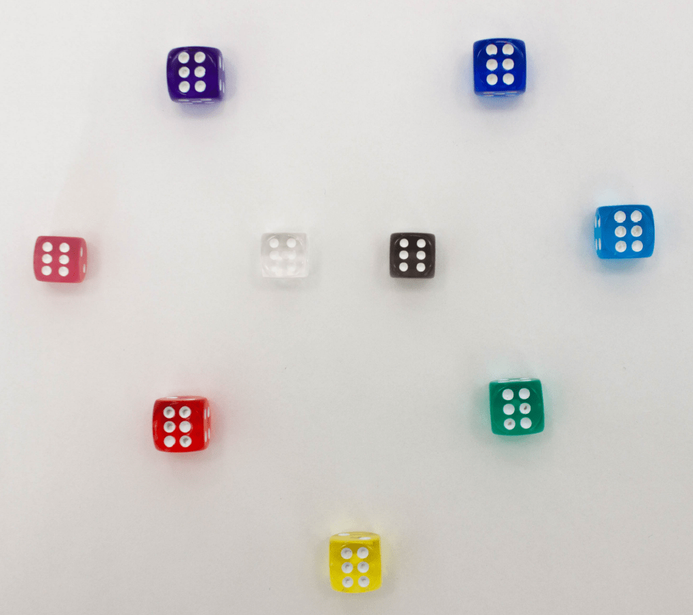
To investigate this theory, the researchers asked the study participants to rank colours in order of preference, and then to do the same thing with dice sets. There was a dice set for each colour that the participant was asked to rank.
Interestingly, the researchers found that people’s colour rankings tended to differ from the coloured dice rankings. Only about 54 per cent of people’s first choice of colour in general was the same as their first choice coloured dice set.
Based on these results, the researchers found that there was a poor connection between colour preference and dice colour preference, leading them to believe that usability is also important when identifying a preferred dice set.
To test usability, the researchers assessed how easy the dice were to read. For this test, they used a selection of dice with unusual colour and ink combinations. Participants noted that it was easier to read high-contrast dice, and the data collected from this experiment showed that using dice with low contrast led to more errors and difficulty in reading the number rolled on the die.
The researchers concluded that colours are significant in the sense that they influence how easy the dice are to use, and how much the player enjoys interacting with the dice. They remarked that the most aesthetically appealing design and colours might not give a smooth usability interaction.
As someone who has re-inked their dice knowing that the new ink will make them harder to read, but prettier to look at, I can totally see where these results come from.
Would you rather have a dice set that was easy to read but in colours that aren’t necessarily your favourite, or a set in your favourite colour that is perhaps more difficult to read? Or do you have a dice set that can do both? Let us know in the comments.
